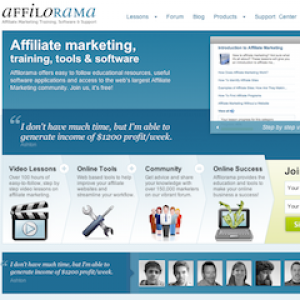
After five months of design and testing, today we're very happy to announce the launch of our brand new redesign of Affilorama!
Our new Affilorama look has been designed to give you faster access to your products, smoother navigation through your lessons and easier access to the latest and greatest information from our blogs and forum! This redesign also introduces a couple of new and improved features including an enhanced favorites menu, lesson progress bars, and improved sharing features!
Affilorama offers easy to follow educational resources, useful software applications and access to the web's largest Affiliate Marketing community. If you aren't already a member of Affilorama, it's free to join! Just click on Register in the top-right hand corner of the website!
If you encounter any issues with the site, please let us know by using the 'Feedback' button at the top-left of the website! Otherwise, we'd love to hear your comments/complaints/compliments below!

Simon Slade • 14 years ago
Well done Paul and team, virtual pat on the back :)
Simon
Nick Fauchelle • 14 years ago
Troy Todd • 14 years ago
Troy Todd • 14 years ago
Thankyou to all involved and I am sure there will be a few bugs here and there...but we can all chip in to help out and make some suggestions and report any bugs etc..
Troy
Abdussalam Muhamad Ekhsan • 14 years ago
Troy Todd • 14 years ago
Troy
Paul Webster • 14 years ago
fear not we have heard you! We'll be working through some misc touch ups over the next couple of days, and font sizing and readability is high on the list.
The forum was the first to receive some attention, and I think you'll find it much more readable if you head on over there now!
Heather Yardley • 14 years ago
Matts Matts • 14 years ago
Clayton A Terao • 14 years ago
Ryan Thompson • 14 years ago
Ross Scott • 14 years ago
What happen to Robert with the videos? Did he get the virtual sack?
Any increase you can see on signup's on your home page with the new look?
I see also you are offering 100% content to visitors in the lessons section before it was like only 25% then you had to sign up for the rest? Is this due to the Google Panda update?
I would recommend having bigger photos of the authors of this blog. I know your old version didn't have any at all. Its just nice to try and build a rapport with the author. Photos help with this and proper author's bio's would help too.
My 3 cents worth,
Masud Diamond • 14 years ago
Ana • 14 years ago
Nida Sea • 14 years ago
Tillata Gibson • 14 years ago
Kieran Gracie • 14 years ago
Eric Marlow • 14 years ago
Leon Wolinski • 14 years ago
• 13 years ago
Niro adrin • 12 years ago